Case Study- Baskerville Type Analysis Poster

For my writing for visual media class, we were asked to pick a typeface of our choosing and write up a type analysis that included important information about what made our typeface so unique. From there we were asked to cut down our analysis to 250 characters and create a poster that visually represented the tone of our typeface.

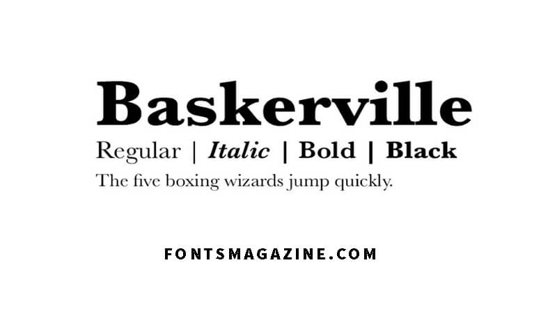
For my project, I picked to work with the sophisticated Baskerville. 

Project

Design a poster that grasps the spirit and unique technical characteristics of a chosen typeface, that is harmonious with the content and tone of a 250 character type analysis of the same typeface.

Requirements: 

Only use the typeface you choose in your design 

-Include the entirety of the 250-character-or-less essay, in some manner

– Have either a glyph, the name of the typeface or the 250-word character block as the main focal point of the poster

Background Research

Before I could start designing I had to really get a grasp of what the font Baserkville was all about. 

In my research I found

  • It was chosen as the most persuasive typeface by readers of the New York Times 
  • It is classified as a transitional serif which is a blend of old-style and modern
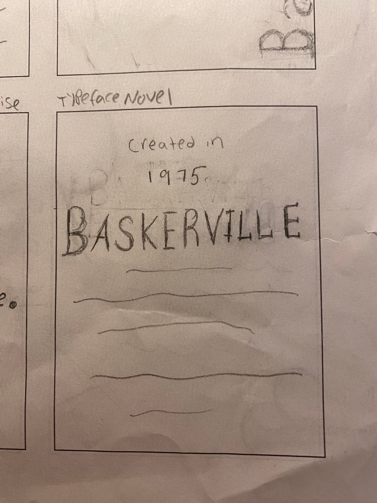
  • It was created in 1975 in an attempt to make older fonts more legible 
  • The typefaces’ crisp edges, high contrast between thick and thin strokes, and generous proportions contribute to the typefaces clarity and readability 
  • It is widely used today for academic publications, and classy brands/logos such as Kate Spade, The Metropolitan Opera, and Better Homes. 

What I took away from my research– Baskerville is a clean typeface. Its sharp nature makes it a very readable typeface. It has a sophisticated tone to it which is why it’s often used in an intellectual way.

Process

Beginning Brainstorm: To begin this project we first picked three adjectives to describe our chosen typeface. A lot of my struggle came from this part of the assignment. In my list of adjectives I had
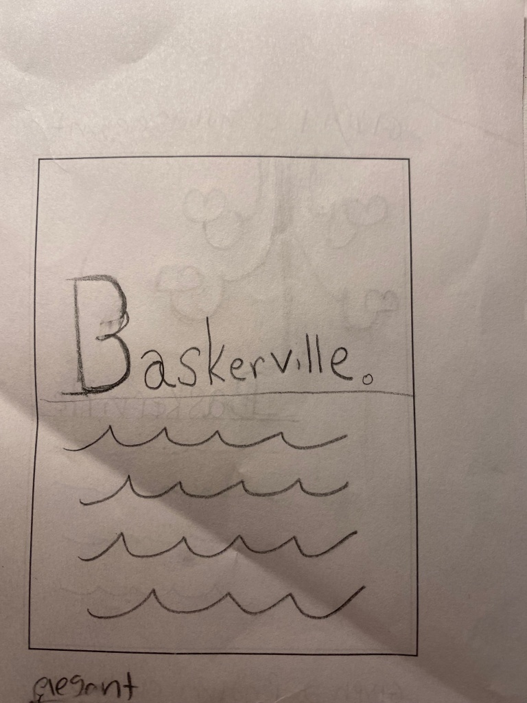
  • Elegant
  • Wise 
  • Intellectual 
  • Modern
  • Classy 
  • Sophisticated 
  • Trustworthy 
  • Clean
  • Sharp
  • Serious
  • Traditional 

Reading the font Baskerville to me makes me feel safe and organized and with this list of adjectives, I felt a lot of my words were almost synonyms for each other however I still did not know which ones would best describe the font. I decided to then create word maps of some of my different adjectives to see what I could come up with. 

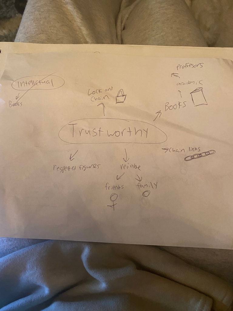
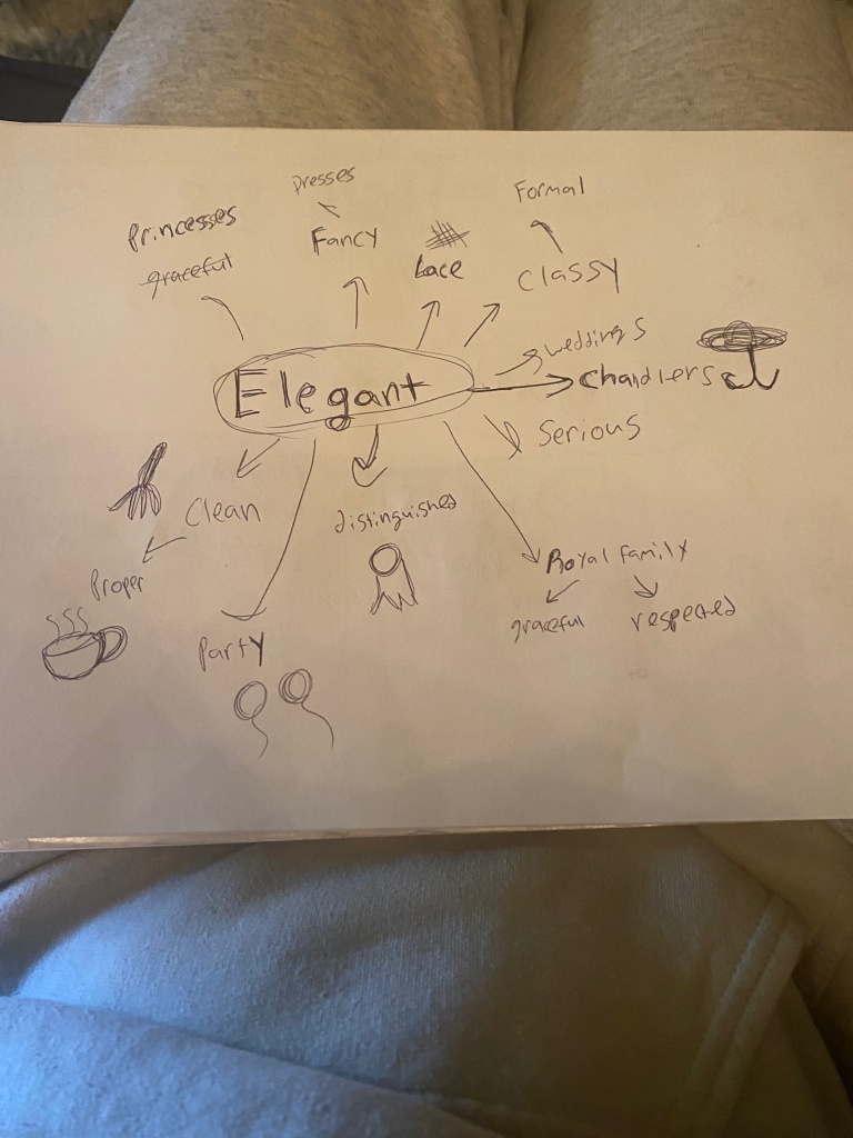
After creating my word maps, elegant, wise, and sophisticated popped out to me the most and seemed to best encapsulate the tone of the typeface Baskerville. With these words, I created my 250 character copy block that I made sure included some technical aspects of the typeface as well as my adjectives. 

​​Final Copy: 

Baskerville is a transitional serif created in 1975. Sharp serifs and high contrast between strokes contribute to the clarity and readability of the font. It is a wise font that exemplifies sophistication and elegance, commonly used for novels.

Sketches

As a designer, I would say I am somebody who likes to experiment a lot and get very bold with my designs. Knowing that this typeface was not a super playful font and rather a serious one I knew I was going to have a little bit of trouble not getting crazy with the design and taking a more simplistic route. I knew I wanted the name of the typeface to be very clean and not spaced out all over the place, which is a consistent part of each of my sketches. I decided to break down my sketches into three categories 

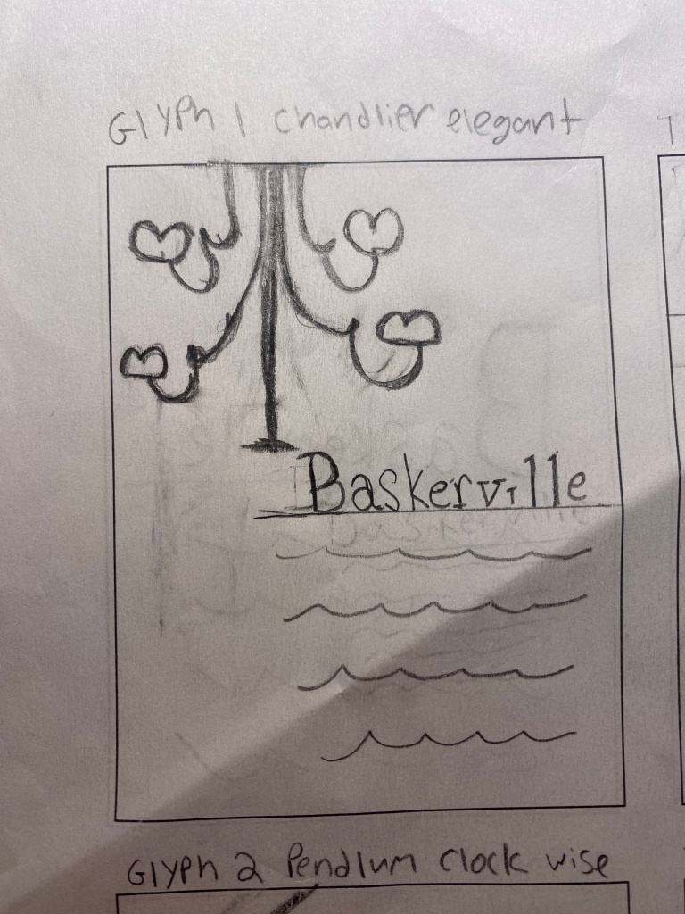
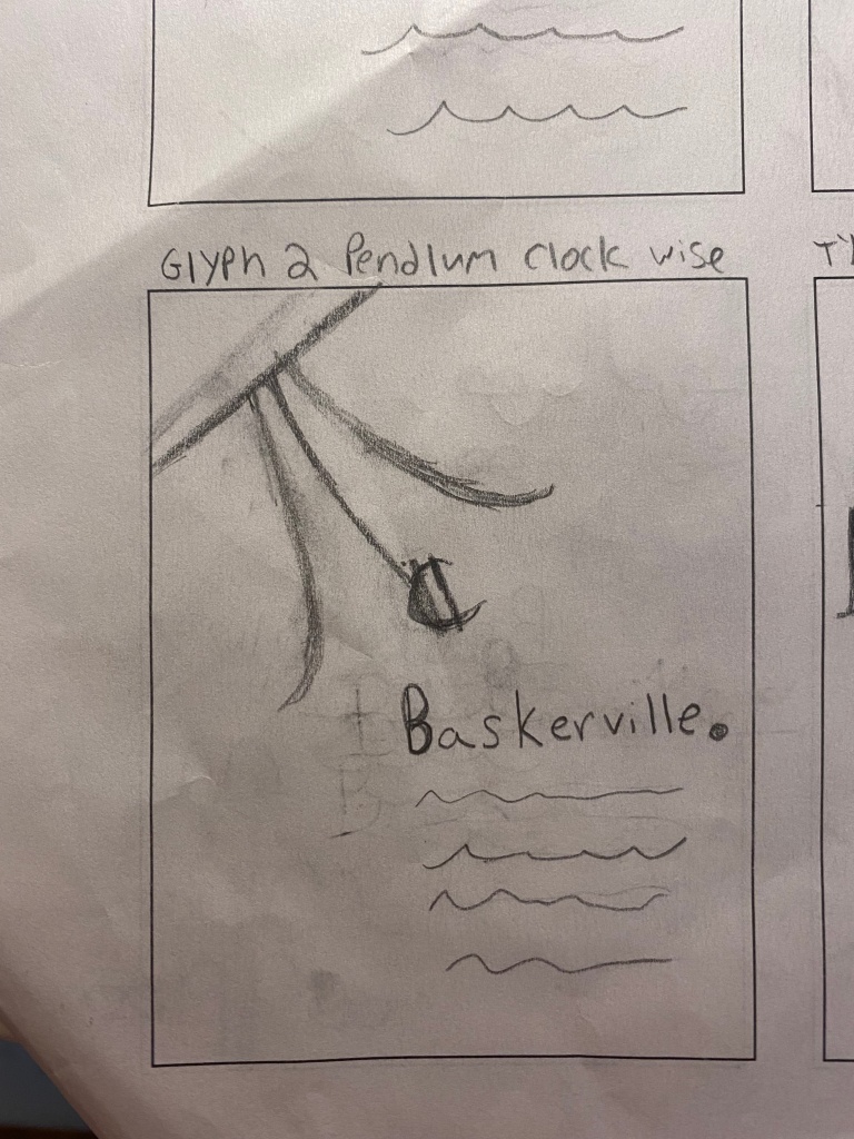
Sketches with glyph focus design  

While I wanted a simple design, I thought I could still get creative with how I used glyphs in my design to construct an object. In my brainstorming maps, the images of a chandelier and pendulum clock both came up as objects that were elegant and wise. As a designer I know a lot of the times I overcomplicate my designs and thought I was going to do this again with trying to construct a chandelier. However, before I even started sketching I looked up glyphs on Indesign and found the perfect glyph I knew I could use to make a chandelier. 

Glyph used in Chandelier

Sketches inspired by storybooks

My next sketches mimicked inspiration I found online. What came to mind when I started sketching were traditional storybooks where the first letter is a lot larger than the rest of the text. I googled  Baskerville and grabbed some inspiration from pictures of the font being used in a very intellectual way in book covers and what seems to be the cover of an academic document. While I did like these sketches I also knew they were a bit of a cliche and read a little boring.

Sketches that emphasize the typeface name

For my last three sketches, I played around with how I could place emphasis on the name of the typeface as the primary focus while still making it simple. I played around with the size and direction of the title Baskerville but was not in love with my sketches. I then started coming up with an idea that somewhat incorporated my storybook idea. I thought if I had Glyphs framing the border of my poster it would look like letters falling out of a novel.  I thought about just choosing glyphs of the letters that made up Baskerville; however, I really like the way the Q glyph looks, so I decided to include that one as well.

Prototypes

Chandelier 

From these sketches, I decided to make two prototypes. I really liked the way my chandelier came out in my sketch so I decided to first create that one on Indesign. Because I had already laid out my glyphs in my sketches I actually had an easy time constructing the chandelier, however, I was playing around with the sizing of it a lot. 

To the left is a prototype using larger glyphs while the right side focuses on smaller glyphs

Storybook

For my second prototype, I really felt like the storybook sketches were the most predictable way to use this typeface and would easily show the essence of the typeface to viewers. 

Feedback

After meeting with my professor we went over all my designs. We both agreed we liked the chandelier however I was starting to get gothic vibes from this design, which is not what I wanted to get across. While the storybook idea had potential, we wound up looking back at my sketches, specifically the one with the glyphs framing the page. My concern with this design was that the glyphs would be the primary focus when I really wanted the title to be the primary focus. My professor challenged me to think about how I could use Dair’s principles of contrast to use these glyphs but still make the name of the typeface the main attraction of the poster. 

Back to The Drawing Board

I really liked how in my chandelier design the typeface title and copy block all aligned to the left and were not centered. I thought the spacing I had created a sense of uniformity and wanted to keep that spacing with this new design. When I first created this new design I played around with the opacity of the Glyphs. By making the opacity of the glyphs lighter than the Typefaces name I knew the emphasis would be on the name of the typeface. Still, however, I was not in love with the design, I felt through this design I lost the element of elegance. 

Sketch 1 using darker colors
Sketch 2 using a lighter opacity

I decided to then start playing with color. I went onto the Adobe color wheel and looked up palettes that were considered elegant. And really fell in love with the muted blue all the way to the right. 


From there I started to figure out ways to incorporate this color into my design. In order to still create an emphasis on the typeface’s name, I still decided to lower the opacity of the glyphs. While I definitely loved the color, something still did not feel right about the design. I still really loved my chandelier glyph design so I tried to find a way to incorporate that into this new design however, it felt too busy.

Prototype playing around with chandelier
Prototype playing around with color

Final Deliverable

Final Poster

After playing around with glyphs I decided a lowercase “A” added a roundness and softness to my poster that I really liked. Through color and size, I was really pleased with how I was able to execute an elegant and sophisticated design that seemed wise and clean.

The Most Persuasive Typeface- A Breakdown on Baskerville

When trying to persuade somebody to do something typically you talk in a sterner voice with a clear tone to show your sophistication. However, if you’re trying to persuade someone of something through a medium that does not allow your voice, such as an email or article, your font needs to read to audiences members as sophisticated- which the font Baskerville does. 

When trying to persuade somebody to do something typically, you talk in a sterner voice with a clear tone to show your sophistication. However, suppose you’re trying to persuade someone of something through a medium that does not allow your voice, such as an email or article. In that case, your font needs to read to audiences members as sophisticated- which the typeface Baskerville does. 

Created in 1975 by John Baskerville in Birmingham, England, this elegant typeface was chosen as the most persuasive font by readers of the New York Times. The typefaces’ crisp edges, high contrast, and generous proportions contribute to the font’s clarity and readability, but the font was not always received well. Just as the font is used today to persuade people, Baskerville had first to persuade others of the typefaces’ worth.

As a servant in a clergyman’s house, John Baskerville’s penmanship talents were discovered by his employer. John then started to experiment with fonts attempting to make older typefaces more legible by experimenting with both calligraphy and printing. Baskerville is classified as a transitional serif, a typeface between “old style” and “modern.” At the time of this transition, many people did not like the changes from traditional fonts. John Baskerville was changing the means of traditional fonts by creating contrast through thick and thin strokes, shifting the axis of round letters to more vertical, and sharpening series; however, its critics commented on the style claiming it was too stark and damaging to the eye. 

However, Baskerville’s font is seen as a bridge between eras that combined classic elegance with modernness. The font’s personality gives an intellectual and wise vibe; however, its serious and classic look is still modern and up to date, which is why it’s so trustworthy among users. Today it is widely used for academic publications and classy brands/logos such as Kate Spade, The Metropolitan Opera, and Better Homes. 

Principles of Typographic Contrast: A Breakdown Through Examples 

When it comes to graphic design, from an outsider’s perspective, I don’t think audience members understand how much work and thought goes into typography design, and I was definitely guilty of that. While it seems like there isn’t much thought put into the type of design, most of the time, the type is the most important element of the poster and follows the seven principles of typographic contrast created by Canadian typographer Carl Diar. 

Diar suggests in order to create contrast considering: color, size, weight, form, structure, and direction are the most important elements. Looking at examples, the Jazztter and John Lewis poster below is a perfect example of how designers use color in their type to create contrast. The designer is able to add an element of fun to this Jazz music album by making certain letters bright, vibrant colors. However, the piece is not too busy on the eye because the designer still keeps some letters white and keeps the background black, stabilizing the piece. In addition, the designer uses the element of form. In order to create contrast through form, a designer must make a distinction between capital letters and lower case letters. In this album cover, the top line starting with “stereo” is in all capital letters, but once you get to the actual album name, the words start to use lower case letters. 

Direction is another way in which designers try to create contrast. In the poster for the movie “Pretty Woman,” rather than having the title of the movie horizontal across the poster, the designer decided to turn the title on its side and make it vertical and then there is contrast created by the copy that is written horizontally. By making the title vertical, there is a dramatic element added. Diar also conveys that the use of size creates emphasis in certain words when creating the layout. In the pretty woman poster, the title of the movie is the most important part of the poster hence why it is the largest piece, and by making the color red, it adds an additional element of importance to the title. The actors’ names and copy about the movie are much smaller and just written in black because they are less critical. 

I think it’s interesting, however, how different designers interpret these design elements in their work. When looking at the movie poster for “Sully,” there are similarities in the elements used to the pretty women poster, but they are used in different ways. The designer of the sully poster still decided to use size to create emphasis; however, the largest word on the page is tom hanks rather than the movie title Sully. In this movie case, I assume that the director wanted it known that Tom Hanks was the main actor because he is so well known hence why that is the biggest word. This designer also chose to create contrast through the structure of his type. To create change through structure, the designer must use different types of letterforms or typefaces. In this poster, “Tom Hanks” is written in sans serif, but as you move down the page, “Sully” is written in serif. Color is used minimally in this poster compared to the Jazz album and Pretty women poster. For the most part, everything is the same gloomy gray except the words “coming soon” that are in red at the very bottom. I think for this poster, it works because the gray of the typeface gives the poster a gloomy feel as the movie is trying to convey. 

Beyond the Design: How Graphic Designers Use Writing Every Day

As a graphic design student, I never really thought writing had a big place in the design world. The basics came to mind for me first. Like with most jobs, I thought graphic designers would most definitely need to use writing to help them communicate to coworkers and clients design layouts. I also imagined that when a designer works for a major brand or magazine, companies might request a letter from the designer to describe their design choices again. 

However, after reading “Design + Writing = Power. How I became a better designer through writing” by Rizwan Javaid and “Highlighting the Importance of Writing for a Designer” by Stella Lincoln, I realized writing for designers goes beyond just emails and documents and can really enhance the overall career of a designer. 

While I’ve taken strategic research classes, I never thought about what research designers need to do, and with research comes research reports and written reflections which is where designers would need to write. I also did not think much of a graphic designer’s personal brand. Beyond email and documents, designers need to be able to articulate their designs to write blogs and presentations. Lots of graphic designers are trying to build their audiences. By having a strong brand voice and being a strong writer, designers can write blogs to share their ideas with other designers and describe their own ideas that will help them garner a following. 

There are instances in my design experience I have utilized writing that I didn’t even realize. Usually, when I create a design, I need to write out all the words that come to mind first. I then like to organize all my ideas for the design on paper. This allows me to feel less stressed out when starting my design leading to better mental health. However, it wasn’t until I read either of these articles that I really thought about how much I use writing for brainstorming or for my mental health.

Thankfulness

For this project we had to make a short film based on the theme of thankfulness. We had to make a production book and make a rough cut and then a final cut. My theme was about silver linings, I had a voice over happening as different b-roll footage was rolling. My idea was just to have viewers think about all the little things they are grateful for. I know for me I don’t always pay my thanks to the little things I have like shelter and food. I also picked a soft indie song to play in the background to make the piece a little more dramatic.

Surviving Com 220

For this project we were tasked to create an interview video. The topic of the interview was tips to survive com 220. We went through the whole editing process by creating a script during preproduction, and making a rough-cut, revised-cut, and final copy of our video. In the actual video we had to insert lower thirds on the speaker and insert b-roll footage and music to make a cohesive film.

Live Portraits

For this project we had to get live portraits of people and create a short video with music and a video. Most of my portraits were outside because at the moment I can’t go inside any of my friends house. It was hard thinking of faces for them to make other then smiling and laughing but I like how it came out! I actually edited all the clips I liked together and decided to find music after but after listening to my music selection I reedited the order and clips I used to make the video flow better. I then voice recorded my poem and edited it into the video.

Audio Journey

This unit in creating multimedia content was focused on Audio. Although I have worked with voiceovers on iMovie before this was my first time using premier. While working on the poem project I was perplexed on how to make the audio sound consistent. I now have a new appreciation for sound editors as I realize it is very hard to make all voices sound consistent when everybody’s voice is a different pitch. My favorite part about this unit was getting to pick out music. I really like creating a mood and for each project I would scroll through First com looking for the perfect music to fit the mood I was going for. I also realized how little recongintion sound engineers actually get while wrtting my report about sound engineering. It was hard for me to find alot of news stories for famous sound engineers and when I looked up the two engineers on wikipedia there was very little about them. I look forward to being able to use a zoom recorder in the future as I used my phone for all of the audio pieces I took.

Project one
project one
Project two
Project four
Task 9

Logos

This Is my professional logo! I made it as if I owned a record company. I tried to keep the color scheme soft but still incorporate my favorite color pink. By having the tape and the headphones I think viewers will automatically know it’s a music company of some sort.

This is my fun logo !! My favorite color is pink so I thought I put different shades in it and coffee is my favorite beverage. I thought the hearts coming out of the coffee cup were fun and quirky so decided to add those with a border around the mug to complete the look.

Digital Campaign

For this project our goal was to produce a digital campaign for a cause we were interested in. We were challenged to use software tools like photoshop to design a website mock page, a poster, a business card, and a postcard. While planning my project I choose to focus on a very relevant issue, the cover-19 pandemic. My campaign is focused on staying inside and what you can do inside. Each of my designs includes the light blue color because I thought It was a very calming color. The fonts on the poster, postcard, and webpage were all supposed to mimic a someone painting the actual letters. Painting is one of the things I’ve been doing while at home so I wanted to put that in my design.

Design a site like this with WordPress.com
Get started